|
ctDropDate |
|
|
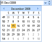
ctDropDate - is an enhanced date-edit object with a built in
drop down calendar with smar t data-entry features. The optional drop-down
automatically displays a built-in drop-down calendar when
clicked. Additionally, spinner buttons may be displayed for
changing displayed date values. Spinners may be set to change
only the day, the month, or the year portions of a date. t data-entry features. The optional drop-down
automatically displays a built-in drop-down calendar when
clicked. Additionally, spinner buttons may be displayed for
changing displayed date values. Spinners may be set to change
only the day, the month, or the year portions of a date. |
|
|
Built
in Drop Calendar : Drop-down
calendar built into the component. |
|
|
|
Drop
and Spin Buttons : Display
the built-in calendar and/or spin buttons. |
|
|
|
Windows Styles : New style properties allow the control to
mimic the styles found under current editions of Microsoft
Windows. |
|
|
Auto-Increment : The
spin buttons can automatically increase or decrease the date by
a developer-specified value. The CaretPosition property is used
to detect the position of the caret
 (cursor)
in the edit region. With the spin buttons, portions of a date
may be changed according to the caret’s position (i.e. increment
only the month or the year portion of the date). (cursor)
in the edit region. With the spin buttons, portions of a date
may be changed according to the caret’s position (i.e. increment
only the month or the year portion of the date). |
|
|
|
Intelligent Data Entry : The
component fills in / completes the entire date when only a part
of it has been entered.
|
|
|
|
Flat
Style : The
component can remain flat until it receives focus or until a
mouse-over event. |
| |
|
Calendar Designer :
Design and view the calendar directly from the controls property
pages. |
| |
|
Formatting Options :
Time formatting options include long or short years, text
alignment, verbose dates, and definable date separation
characters. |
| |
|
|
|
|
|
|
|
|