|
ctGrid |
|
|
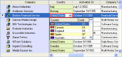
ctGrid lets you add customized,
interactive data presentations to your projects easily and
efficiently. With formatted data entry,
 styles, combo boxes, column locking, column sorting, auto column
sizing, XML data and styles support and more...ctGrid adds a
whole new dimension for data entry and presentation. styles, combo boxes, column locking, column sorting, auto column
sizing, XML data and styles support and more...ctGrid adds a
whole new dimension for data entry and presentation. |
|
|
Formatted Data Entry : Each column in
the grid can be set up with a different data type. Data types
supported by ctGrid include... |
- Text : Standard text.
- Numeric
:
Integers, reals,
percentage, and currency.
- Dates : Verbose or Numeric. Options for date
formatting characters.
- Times : Options for military time, Am/Pm, and
time formatting characters.
- Masked Text : Alpha or numeric data, upper case,
maximum characters.
- Boolean : 3d or flat check
boxes, or character data (True/False, Yes/No)
- Combos : List or combo styles
- Images : Support for images in any cell
|
|
XML and ADO Support :
All data,
including presentation detail, consumed in ctGrid can be
imported from or exported to an XML file. |
|
|
|
Definable Styles : Assign a style to
a singe cell or to all cells in a column. Styles include... |
- Border Type
- Border Color
- Background Color
- Text Color
- Text Alignment
- Font
- Read-Only Status
|
|
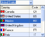
Combo Boxes : Create and assign combo
boxes to any column in the grid. The combo boxes hosted by the
ctGrid control contain a variety of useful display and selection
features including...
|
- Multiple Columns : Up to 6 different columns
- Column Headers : Definable column headers.
- Auto-Complete Feature : Helps to find/enter data
within the drop list.
- Auto-Swap : This option moves most recently
selected items to top of list.

- Auto-Search : This feature incrementally searches
by first character of list items.
- Images : Assign a bitmap or icon to the first
column in the combo box.
- Alternating Line Colors : Alternate lines colors
in the drop list.
- List Lines : Optional vertical and horizontal
list lines.
- Formatted Data Entry : Assign a data mask to the
edit box.
|
| Auto-Complete Feature :
Auto-Completion expands a string that has been partially entered
into an edit window. It works by dropping down a list of
possible text items as the user types characters into the edit
window. |
| |
| Conditional Data Entry : Along with
defined data types and data masks, ctGrid contains a variety of
other options to make sure that data entered into the grid is
being entered correctly. Some of these features include... |
- Data Validation : A ResetEdit method to prevent
the edit window from moving to a new cell (possibly because
of invalid data being entered into the current cell).
- Moving To A New Cell : The ResetEdit method
allows the developer to move focus to any other cell after
the current cell has been edited. It can be used to override
the default behavior.
- Read-Only Status : Cells can be set up to be
read-only. The read-only status can be changed at any time
through code (i.e. the status is not permanent).
- Cancel Edit : This method stops all editing
features.
- Starting the Edit Procedure at a Given Cell : By
default, all edit operations start at the first available
cell of the selected item. This functionality can be
overridden through a function call.
- Preventing Key Strokes : This option allows us
to set up situations where a cell will only accept certain
keys (i.e. 1-4, a-c, etc).
|
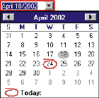
 Drop Down Calendars
:
Drop down
calendars can be assigned to the cells in a date defined column.
The calendar is fully customizable including options to change
the day and month name strings. (i.e. into other languages) Drop Down Calendars
:
Drop down
calendars can be assigned to the cells in a date defined column.
The calendar is fully customizable including options to change
the day and month name strings. (i.e. into other languages)
Numeric Column Calculations : Column
or column range functions for Sum, Average, Minimum, and
Maximum. |
|
|
|
Print The Grid :
Built in print feature makes it easy to print the grid. Support
for a wide variety of paper sizes. Custom properties and events
allows the control to accommodate unconventional paper sizes. |
| |
| Built-in Text Search : Search for a
text string in a given column. Support for soft-seek and case
sensitive search. |
| |
| Alternate Line Colors : Alternating
groups of lines switch background color in grid rows. |
| |
| Conditional Formatting : Numerics can
be set up with different text colors depending upon whether they
contain positive or negative values. |
| |
|
Pre-Column : Add a pre-column to the
grid. |
| |
|
Masked Bitmaps
: Support for masking of bitmaps. |
| |
| Tool Tips : ctGrid is capable of
displaying two different types of tool tips within the control.
These consist of... |
- Scroll Tips : Tips that appear when the vertical scroll
bar is being moved.
- Cell Tips : Tips that appear when the mouse moves over
specific cells.
Internal Image List
: An internal image list can be used to assign images
to cells and column headers of the list control.
|
| |
| Column Designer Property Page
: Design all columns through the controls property pages
at design time. |
| |
| Virtual Mode : Present large sets of
data without the need to load all data at time of display. |
| |
| Column Locking : Lock any number of
columns to prevent data from scrolling out of view. |
| |
| Multi-line Column Headers : Option to
wrap header text to multiple lines. Adjust header to any height. |
| |
| Automatic Column Sizing : An option
to automatically re-size a column so that the largest text
string in the column can be fully viewed. Another option allows
the column width to be shrunk if too much space is currently
assigned to the column. |
| |
| Column Sorting : Sort any column in
the grid, or prevent a column from being sorted. |
- Intelligent sort recognizes data type when sorting.
- Sort up to three columns simultaneously.
- Mark a column as sorted to reflect the addition of
pre-sorted data to the grid.
- Sort on Case - pre-define Case sensitive sorting.
- Sorts in ascending and descending order.
- Pre-sort Event with Cancel Sort method.
|
| Column Header Alignment : Independent
header alignment from the default column alignment. |
| |
| Horizontal Scroll Option : Scroll the
columns either pixels at a time, or entire columns at a time. |
| |
| Column Key : The ability to identify and search for a
column through a key value stored in a column. |
| |
| |
| |
| |
| |